Vilmos Huszar
Vilmos Huszar
Cover Design
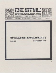
The cover design and title pages for De Stijl by Vilmos Huszar is another example of a composition using De Stijl principles. This piece combined his composition with type and Theo van Doesburg's logo to create a concise rectangle in the center of the page. All of the shapes seen on the cover only consist of rectilinear geometry and straight edges.
Title Pages
There are absolutely no curvilinear elements on both the cover and the title pages, keeping his design very consistent. Huszar uses white space effectively by giving the audience visual breathing room because of the intricate and busy layout. His use of the rectilinear geometry is almost puzzlelike in both the centerpiece and the logo, and the overall design is vertical. The justified text that perfectly aligns with all the other elements executes visual hierarchy and unity. The choice of font is also kept consistent with the other shapes of the elements, and Huszar constantly shows consistency in his design.
A similar design style is also seen on the title pages of the
De Stijl magazine, this time, with a different layout. The typography is placed on each side of the logo and under, creating an almost horizontal feel compared to the cover page that was vertical. Huszar continues to use linear and rectilinear geometry, and an effective use of space throughout all three pieces. He presented a positive/negative figure/ground study in spatial relationships.


Comments
Post a Comment