Bart Anthony van der Leck
Bart Anthony van der Leck
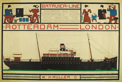
Batavier Line Poster
The Batavier Line poster designed by Bart van der Leck
in 1916 uses flat pure colors and bold horizontal and vertical
spatial divisions that build the design. This poster executes De Stijl principles in its bold, thick black lines and sans serif font, but the colors used and the imagery does not. It is stated in Meggs' History of Graphic Design that because of World War I, this poster could not be used; the shipping lines between the Netherlands and the United Kingdom were severed. When it was eventually employed during the 1920s the text and colors were changed, infuriating Bart van der Leck. This piece is the first printing of the poster and reflects the original design of the artist.
Exhibition Poster
The exhibition poster by Bart Anthony van der Leck designed in 1919 shows pictorial art combined with De Stijl principles. He diverted De Stijl's vocabulary toward elemental images, and successfully creates the appropriate mood to represent the De Stijl movement. Bart Anthony van der Leek's open compositions of forms constructed of horizontal, vertical, and diagonal lines and shapes separated by spatial intervals are also found in works ranging from early posters to book designs and illustrations of the 11940s, portraying that Van der Leck was exceptionally successful in many of designs, such as this one. He uses a typeface that is similar to the De Stijl logo to create harmony, unity, visual hierarchy and consistency in this poster. The shapes seen in the center, which looks like a man riding a horse, is created out of the shapes that are composed in the typeface. The effective use of the color yellow to distinguish between the two is very clever, especially when creating a piece that is almost abstract. The blue rectangle, followed by the thinner red rectangular line, and the bigger red rectangle creates and implied rectangular shape that create the focal point of the composition. The yellow pulls the three together elements as harmonious units, which definitely work together and complement each other. It has harmonious similarity in its consistency of elements, and every element relates to each other. The placement of the typography breaks the viewers eyes from the forced implied rectangle that is the focal point, and adequately sends the message of this exhibition event across to the audience.


Comments
Post a Comment